inception
Original page: https://www.prometheus.ninja/projects/inception
project overview
Every project needs a home base. For the Prometheus Project, that means a functional, visually appealing website to share content, resources, and lessons. Building a website from scratch within the week’s constraints is both a practical challenge and a meta-start to this journey—setting the tone and structure for everything to come.
Launch a hosted website connected to a domain, establish the foundational structure, and create a functional platform to support future project posts. This post itself serves as a demonstration of the format and approach that will be used in this project going forward.
build process
In the following sections, I’ll go over a high level summary of the steps taken to build this website. I’d like to strike a balance between having a reasonable “high level view” of items, while getting into the nitty gritty on some of the things that are less straightforward. I’m happy to answer any questions or explain further wherever it would be helpful and I would love feedback on how to structure these posts in the most useful way!
The basic structure of this post (Overview, Build Process, Lessons Learned, Toolbox and Next Steps) are intended to be a “standard” / consistent post structure going forward, but I’ll iterate and tinker as we go!
Starting a website is simpler than may seem. The first step is purchasing a domain name—the unique address you type into the URL bar to visit a website. Personally, I’ve always used GoDaddy, partly thanks to their long-standing Super Bowl ads that stuck in my memory. That said, any domain registrar will work. Just search for the domain you want, and they’ll show you available options along with different extensions to consider.
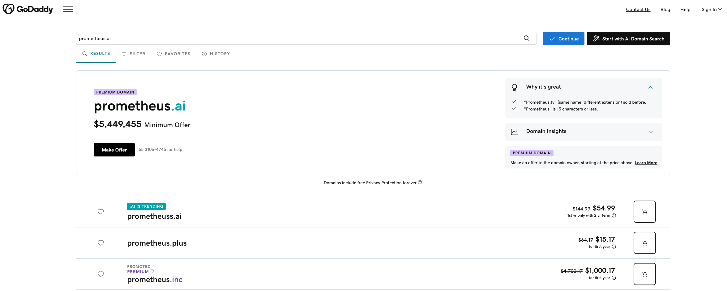
The domain was purchased through GoDaddy during a promotional period (right before Black Friday). Using Honey to find a discount code saved a little money, but ironically, GoDaddy’s built-in promo turned out to be the best deal. Went with prometheus.ninja as it was reasonably priced and the fun domain extension could be used for some branding purposes for this project. JOIN ME, NINJAS!
I was initially excited that “prometheus.ai” seemed to be available, and dismayed when I realized I misunderstood and that it’d cost $5m to purchase that one. Bit too rich for this project.
Once you have a domain, the next step is creating a website and hosting it. In my experience, the cost difference between hosting providers is minimal, and keeping everything in one place for managing active content on a month-to-month basis is just more convenient. When it comes to creating the content, there are a litany of website builders out there that provide a nice GUI to work within for building.
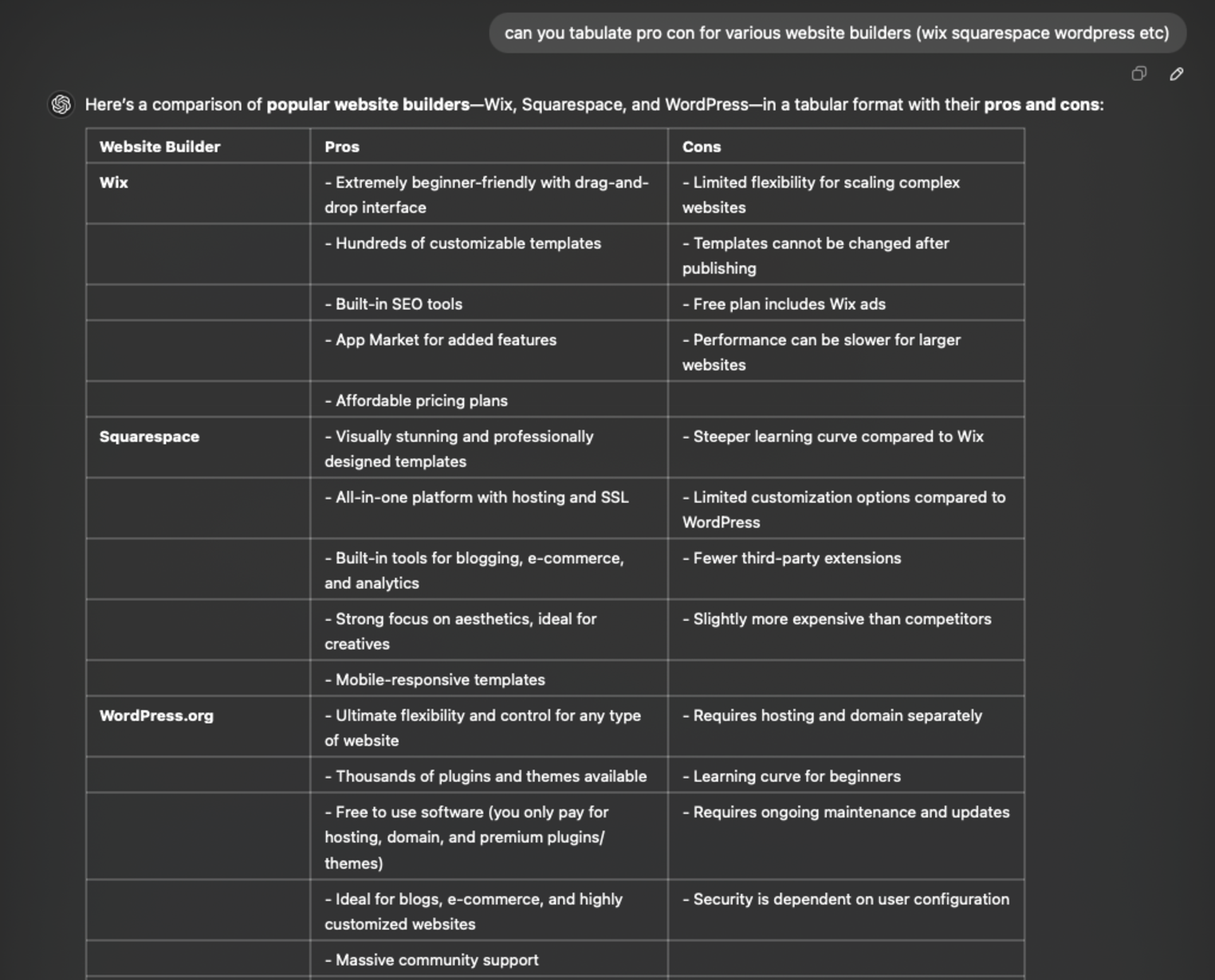
Credit to ChatGPT for providing some comparisons on website builders that could be used.
Squarespace struck the right balance between beginner-friendly and feature-rich. Its templates helped create something polished while saving time, and its mantra—“A website makes it real”—felt like the motivation I needed to get started. I’m comfortable getting in the weeds with behind the scenes HTML/CSS editing and Squarespace was billed as a platform that allows that. I’ve used other website builders in the past and gotten frustrated with various aspects — but, so far so good here.
There are a variety of tools and features that I’ve been exploring, particularly within its user-friendly GUI. While figuring out how blog and image blocks work can take some trial and error, the editor itself is intuitive. It makes aligning elements, adding captions, and customizing layouts fairly straightforward—even if it takes a bit of effort to get everything just right.
Ooooh scary words. Some of the nuts and bolts of how your website actually becomes available to view can be a opaque at first, but today’s creation tools make it easy to set up and understand what’s happening. Hosting is what allows your website content to be available online for others to view. Whenever I’ve created websites, I’ve always opted to pay for hosting through the same platform as what I am using to build the content itself — in this case, Squarespace. When going through the setup wizard (🧙) it will ask you about hosting options as follows.
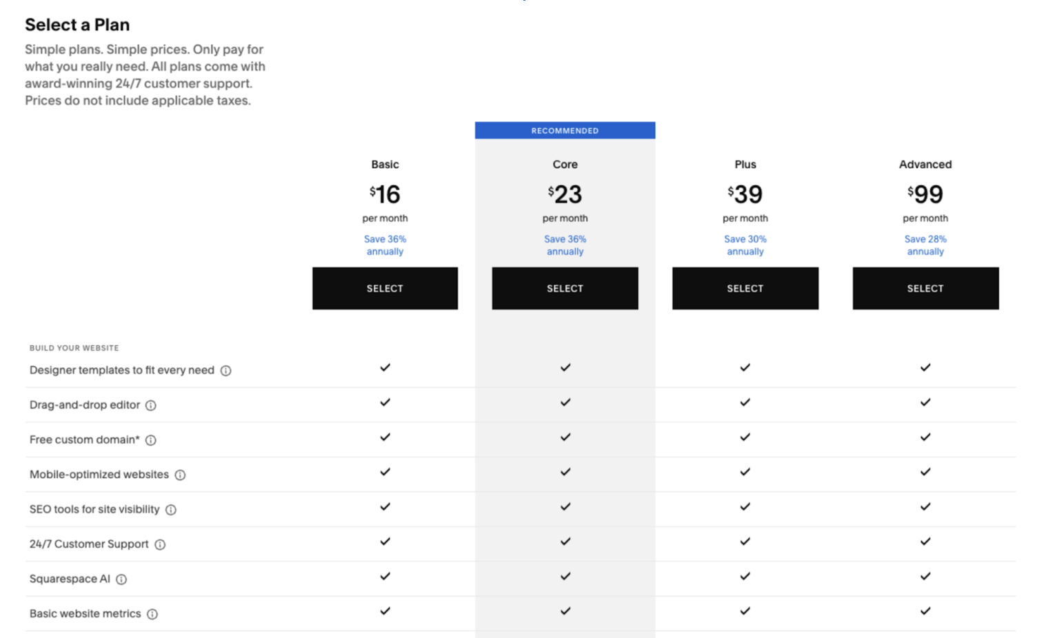
Squarespace (and any hosting/creation platform) offers plenty of different options to get your site online. Unless you know exactly what you need when starting a new project, I find it best to just go with whatever the “basic” option gets you to start.
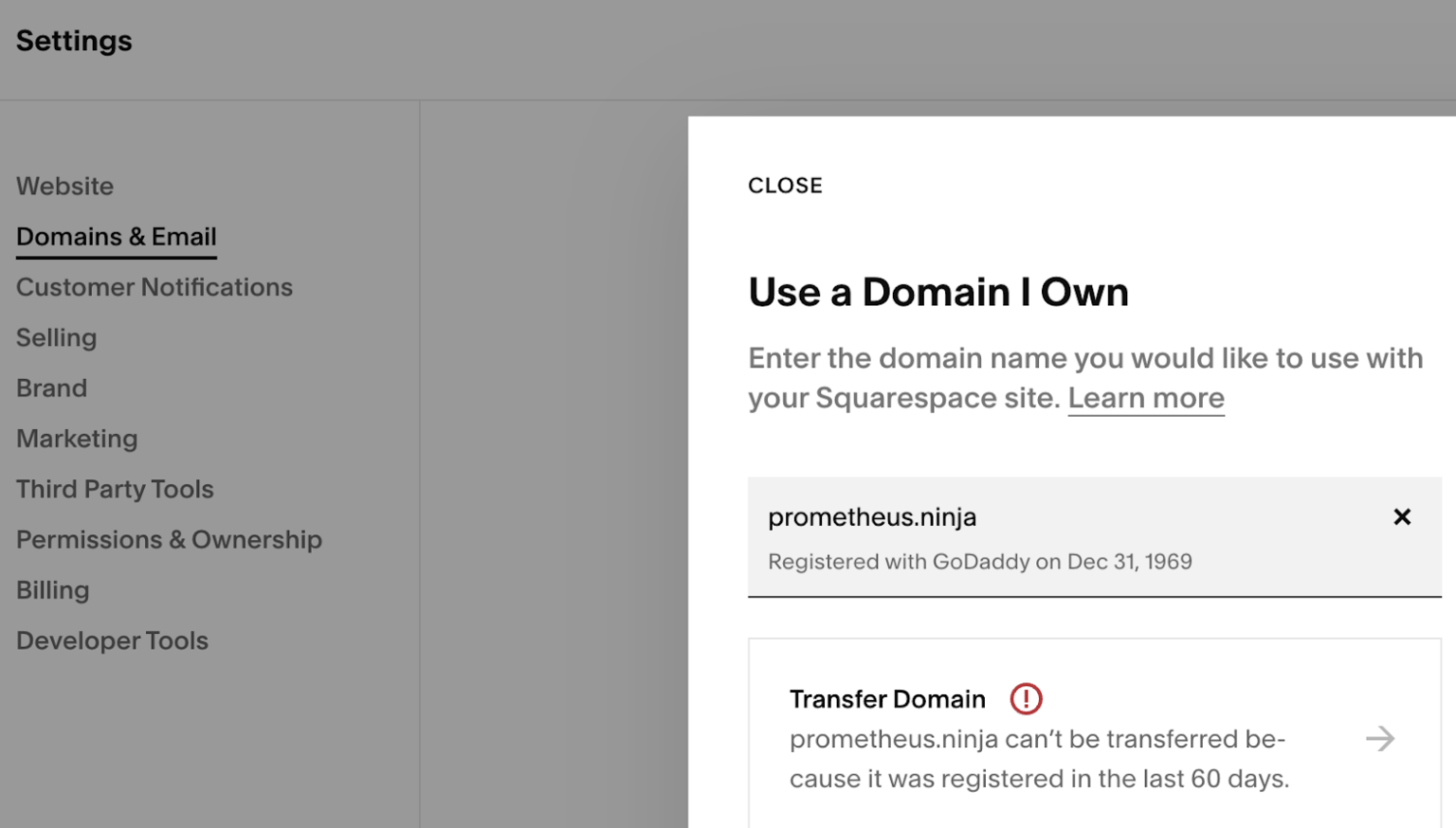
They’ll let you know when you try to do something that costs more money… and you can always just upgrade your plan if needed. $16/month ain’t so bad to start. After purchasing a plan it’s time to actually connect all the magic internet pipes to make whatever content you’ve built appear when someone goes to the domain that you purchased (from GoDaddy) when this process started. You can go to your Squarespace dashboard, navigate to settings, and head to “Domains and Email” to get this done.
Not sure why the registration date transmits this way (Dec 31, 1969, nice) but for our purposes, you’re allowed to believe that I built a time machine to get this website up and running 18 years before I was born.
- It’ll ask if you want to “transfer” your domain: move from your current registrar (GoDaddy) to a new one → this means you’d pay Squarespace the annual domain parking fee instead of GoDaddy. This can’t be done very frequently and is honestly … kind of a pain.
- OR it’ll ask if you want to “point” your domain at the Squarespace hosting you’ve purchased which basically tells your current registrar “show this content when someone goes to this domain” … this is a quick and relatively painless option (and the one I went with for this project).
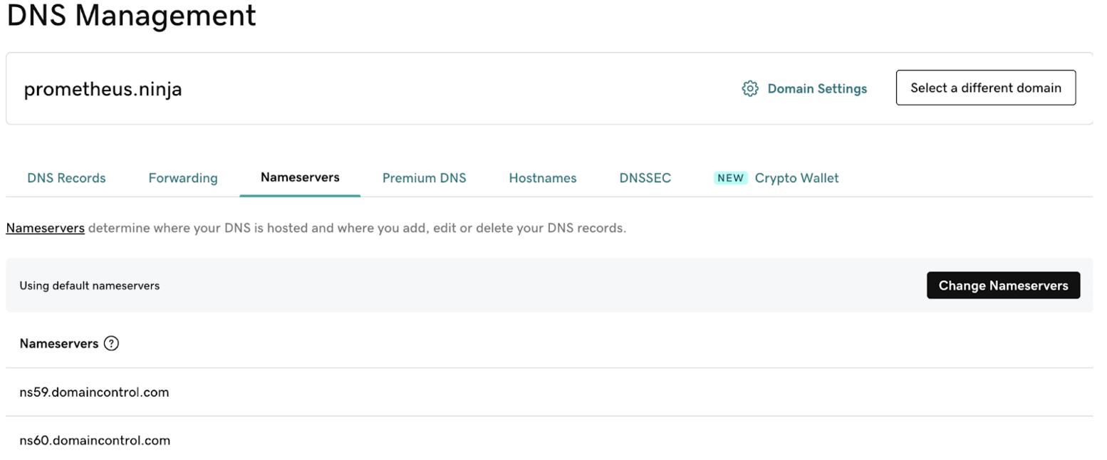
To “point” the domain at your hosting, you head back to your registrar, GoDaddy, into settings, and find DNS management in order to change Nameservers for the domain.
Squarespace provides awesome instructions for doing this step by step — but what ends up happening is popping in a few text strings that tell the registrar what content to “point” to. After waiting a few hours or maybe a day for this “pointing” to “propagate” … the website you’ve built is then going to be visible at the domain you purchased!
No, that’s not actually what CSS stands for. CSS, or Cascading Style Sheets, is a language used to control the visual presentation of a website. It defines how HTML elements should look, including layout, colors, fonts, spacing, and more. Essentially, CSS allows you to customize the appearance of your site, making it visually appealing and user-friendly.
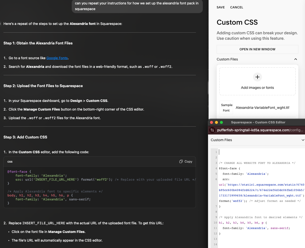
I won’t sit here and pretend to be an expert on CSS, but I know enough to be dangerous. And with GPT at your side, getting things just right these days is a breeze. For this website, I wanted the font to be in my preferred “open font” of Alexandria. It’s what the text you’re reading right now is in and frankly I just find it pleasant to look at while I’m working. Now, there may be better ways to do this, but going into Squarespace “styles” — which you’d normally use to set the fonts for your Heading 1 / Paragraph 1 / Normal text, etc etc — can be kind of overwhelming. I didn’t see a way to directly upload the Alexandria font pack in the UI, but asking GPT how to do this led to some fun workarounds.
I’m including both the GPT instructions and the resulting output in the Squarespace custom CSS editor here for clarity.
In this case, we can see that I put the downloaded Alexandria font tff into the “custom files” input, then pasted the code GPT provided after modifying it. After doing all this, the entire website now displays in my font of choice!
There’s loads of things you can do with CSS beyond this implementation. If you can’t quite format something right, just ask your friendly neighborhood Spiderman GPT for help and it’ll point you to the code and places you need to make the change.
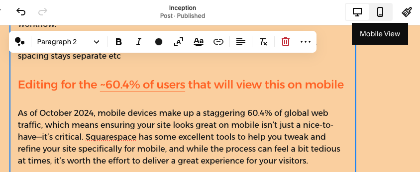
As of October 2024, mobile devices make up a staggering 60.4% of global web traffic, which means ensuring your site looks great on mobile isn’t just a nice-to-have—it’s critical. Squarespace has some excellent tools to help you tweak and refine your site specifically for mobile, and while the process can feel a bit tedious at times, it’s worth the effort to deliver a great experience for your visitors.
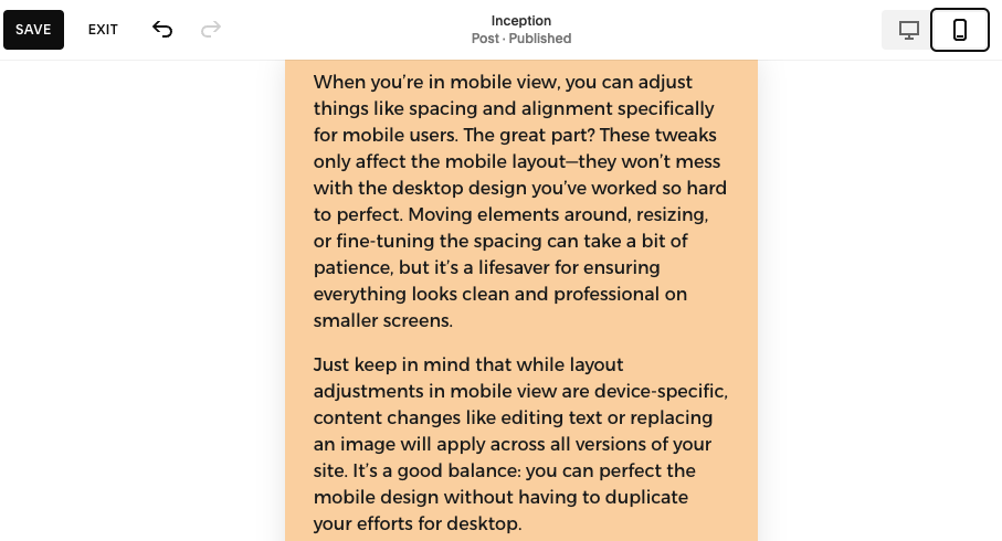
To start, you’ll want to switch to mobile preview mode in the Squarespace editor. Look for the little device icons (desktop, tablet, mobile) and click the mobile option.
This lets you see exactly how your content will appear on phones, which is a great way to catch any weird alignment issues or overly large elements that might look fine on a computer but overwhelm a smaller screen. Ironically, I reached the end of this post and found that these cute white caption boxes don’t work great on mobile… something to work on at some point but for now, do as I say — not as I do 👀.
When you’re in mobile view, you can adjust things like spacing and alignment specifically for mobile users. The great part? These tweaks only affect the mobile layout—they won’t mess with the desktop design you’ve worked so hard to perfect. Moving elements around, resizing, or fine-tuning the spacing can take a bit of patience, but it’s a lifesaver for ensuring everything looks clean and professional on smaller screens.
ep in mind that while layout adjustments in mobile view are device-specific, content changes like editing text or replacing an image will apply across all versions of your site. It’s a good balance: you can perfect the mobile design without having to duplicate your efforts for desktop.
Finally, don’t forget to regularly check how your site looks on both desktop and mobile, especially after adding new content. A little extra time spent toggling between views can save you from someone visiting your site on their phone and seeing a big mess. With mobile users making up the majority of web traffic, these small adjustments go a long way toward making sure your site is accessible, functional, and polished for everyone.
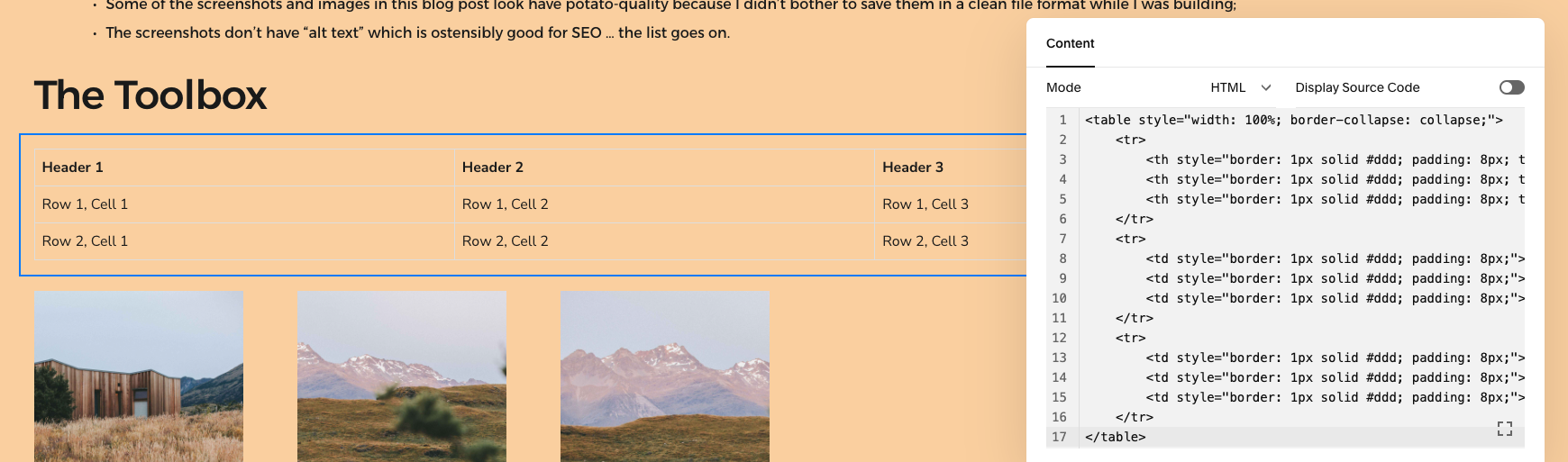
When I first set out to include a tools table in this post, I assumed Squarespace’s built-in editor would offer an easy way to create a simple, clean table. While Squarespace excels in drag-and-drop flexibility for images and text, I quickly realized that it doesn’t include native support for tables. This limitation led me to explore alternative solutions, and after experimenting with workarounds, I settled on using a Code Block to craft the table.
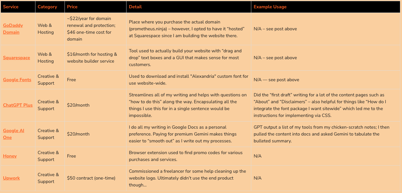
By switching to HTML, I gained complete control over the table’s design, including the ability to add custom links, bold styling, and even a splash of color to make the header row pop.
I used ChatGPT to generate the initial code for the table, which saved me a ton of time. From there, I refined it to fit the post’s layout and functionality. I also set up a reusable prompt to streamline the process for future posts, so generating a similar table will be as simple as copying and pasting. This solution not only looks polished but also ensures consistency across future tools tables in upcoming projects.
Working with an Upwork freelancer on the logo for my website was a learning experience. My vision was a logo featuring “flames being assembled by Tetris bricks,” something that felt creative and visually distinctive. While I initially liked the design generated by GPT, I thought a professional graphic designer could refine it into something cleaner and more polished. I set a modest $50 budget for the project, knowing full well that great design often comes with a much higher price tag.
The freelancer I hired worked hard and took the project seriously. Despite several iterations and a (badly) drawn sketch I provided to clarify my idea after a few tries back and forth, we couldn’t quite land on the “perfect” execution. I could tell the designer was giving it their best effort within the constraints of the budget and the somewhat abstract vision I presented. In the end, I chose to close out the project, paid them in full, and left a positive review—because I didn’t feel the outcome was their fault. It was more a matter of balancing expectations with resources and, well, maybe the vision I had was honestly just not good.
From a value perspective, getting four revisions on a logo design from a freelancer for $50 is amazing. The individual was willing to keep going as well, wanting to do a “perfect” job. That said, I had done probably 50+ prompts with DALL-E to get to that first revision… the scalability of using AI is insane and when the ability to iterate with these (AI) tools improves, we’re going to be in an interesting place.
Ultimately, I’m content with the GPT-generated logo that you see on my homepage. While it’s not perfect, it works for now. Down the road, I might revisit the idea of a logo update and invest more in a professional designer to really capture the creative vision I have in mind. This experience was a reminder that great design is often a collaborative, iterative process—and sometimes, you do get what you pay for.
results & lessons learned
The website is live and functional with a clear structure and placeholders for future enhancements. This post is an example of the structured content it’s designed to host, and future posts will follow a similar format.
The site now serves as the Prometheus Project’s home, centralizing content and demonstrating the “build-in-public” ethos. Future project writeups will be posted on this blog directly while we also build up things like the Toolbox as more content is created.
- Simplify Documentation: Writing posts like this takes time — mostly just to get the formatting right and insert images etc. I need a better way to capture my stream of consciousness and relevant screenshots during working sessions, given I was often going back to recreate an image and such. I’m looking into tools to help me with active capture of my work and I’m open to suggestions!
- Things rarely go as expected, and the perfect solution might involve detours: One of the biggest takeaways from this project is that the way things get implemented often doesn’t align perfectly with what you expect—whether it’s creating a logo, building a table using a code block, or navigating website tools. For example, I assumed Squarespace would have a simple solution for inserting tables, but instead, I ended up coding one manually for more control. Similarly, hiring a designer to refine my GPT-generated logo taught me that even with a clear vision, execution isn’t always straightforward.
- Embrace “Done is Better Than Perfect”: It’s better to have a functional site than endlessly chase perfection. Examples: Some of the screenshots and images in this blog post look have potato-quality because I didn’t bother to save them in a clean file format while I was building;
- The screenshots don’t have “alt text” which is ostensibly good for SEO … the list goes on.
With all of the Prometheus Projects, I’ll be trying to keep costs to a minimum. However, it isn’t going to be realistic in many cases to have cost be zero. So we’ll summarize spend according to supporting costs (use of supporting tools like GPT etc) versus ongoing project costs (expenses that will become recurring if the tool/project is “kept alive”) versus one-time costs (as it sounds. one time costs associated for that specific project; you get it).
for inception — the project to create this website, the costs were as follows:
one-time project cost: $96
ongoing project costs: $16/month + $22/year
supporting tool costs: $40/month
Someday I’ll fix this for mobile. For now, it’s an image 🤦 Links if you want them:
godaddy domain
google fonts
chatgpt plus
google ai one
There’s a handful of things that I’m mulling over with regard to taking this website to the next level — but for now, it’s a parking lot and a home for me to write about the Prometheus Project and document my efforts in this space! Things I’ll be thinking about:
- The Toolbox is going to need some kind of optimization to make maintaining the tables easier, possibly by incorporating database features. There are more tools I use daily that are worth sharing that I’ll want to add and surely more things that come up with future projects so it needs to be easy to update.
- The website could benefit from visual upgrades, improvements for mobile and better blog post navigation — but for now, it serves as a functional home for posts and (*fingers-crossed*) traffic.
- SEO might be dead (long live our AI overlords) but there’s probably still some utility in taking some basic steps for site optimization to potentially get organic traffic here instead of just forwarding from LinkedIn / referrals. We’ll see!